Create a webform: Advanced question styles
Looking for some more advanced question styles for your webforms?
- Multiple pages
- Field sets
- Format-specific fields: Date, Email and Time
- Markup
- Multi-question grids
- File upload field
- Text area
Be sure to check out Create a webform: Basic question styles if you haven't done so already - this tutorial will only cover some advanced components and how to use them.
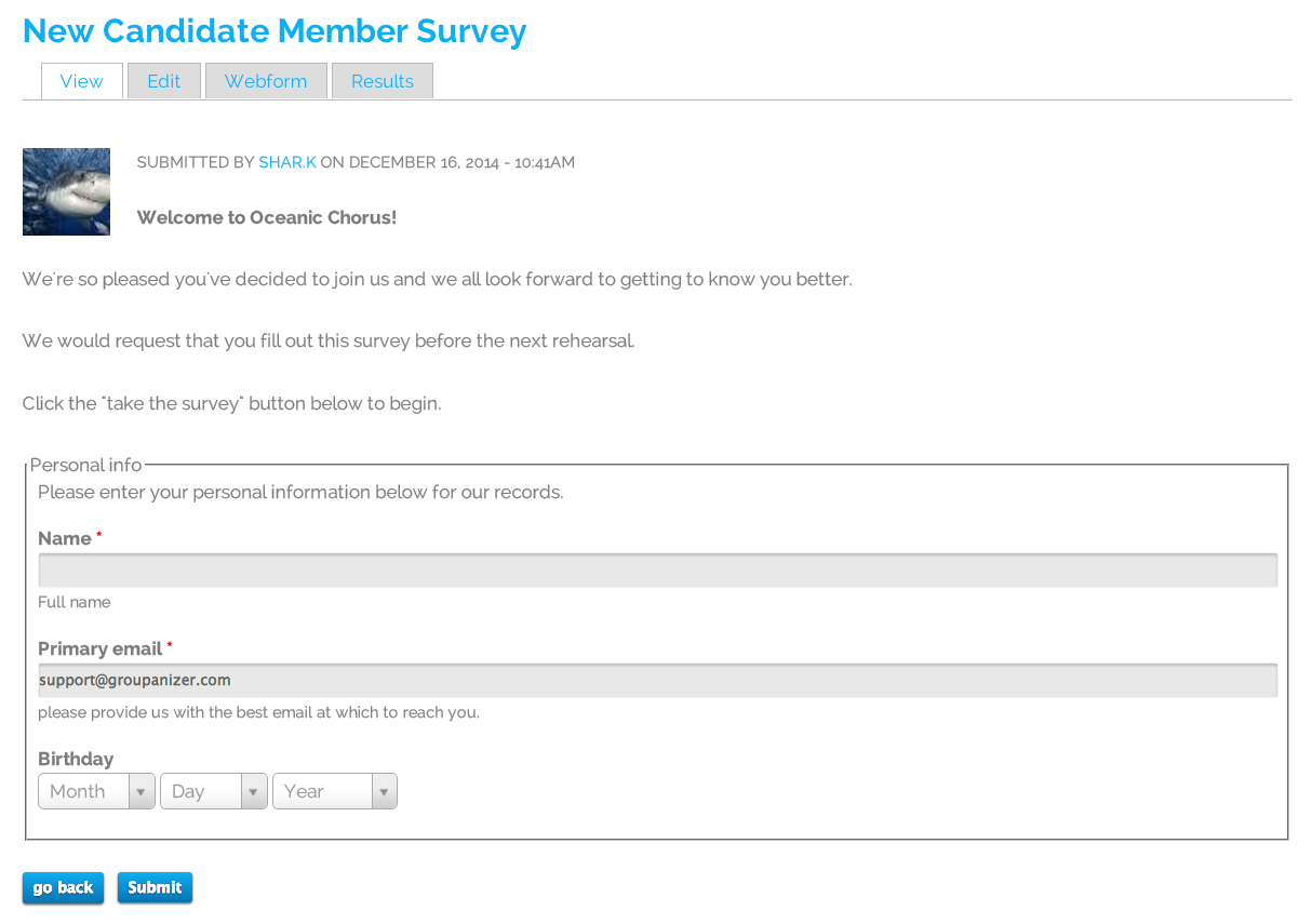
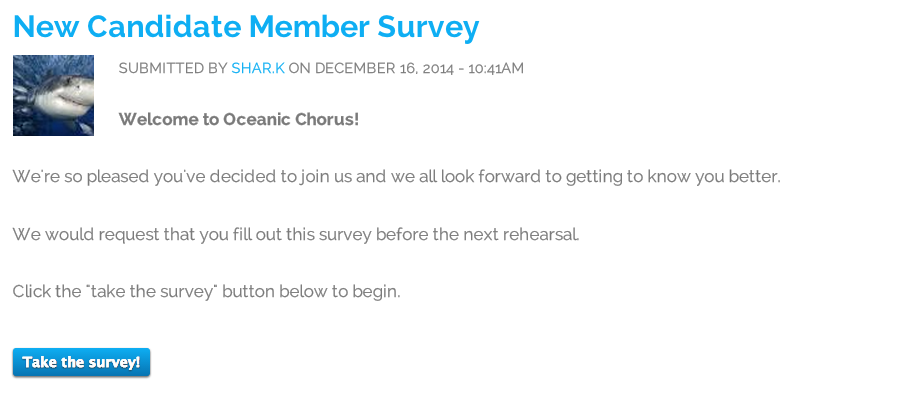
In this example, we'll be creating a new candidate member survey.
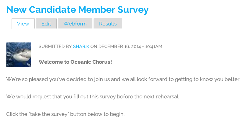
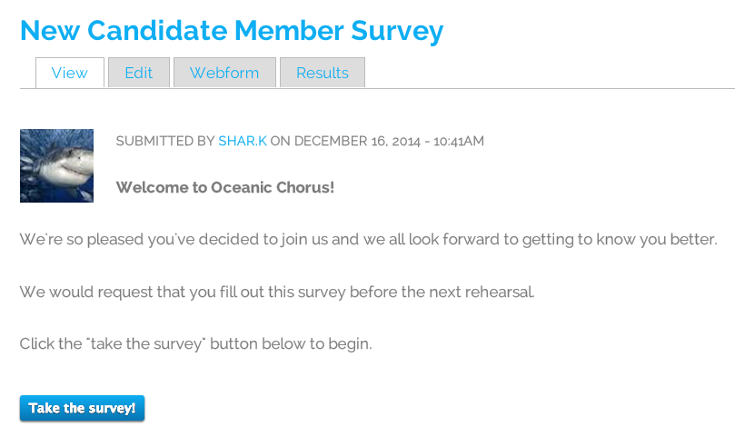
So far, we've created the title and description, and have not added any components. It looks like this:
Multiple Pages
You'll want to add the component labelled "Page break" and click add.
Here's an example of the kind of settings you can choose.
And here's what it looks like once it's been saved:
And on the next page, the button looks like this:

Field Sets
Field sets are a great way for group questions together. To use a field set, add the component type "Fieldset".
Here are the settings options that you will have:
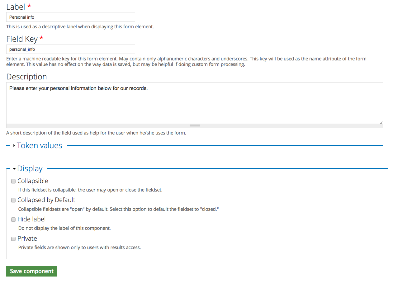
You can make a field collapsible, but if it's a field that is mandatory, this is not recommended.
Once you've added your field set, make sure that anything that should be within the field set is nested below it. You can drag it by the cross-hair arrows on the left.
Here's an example:
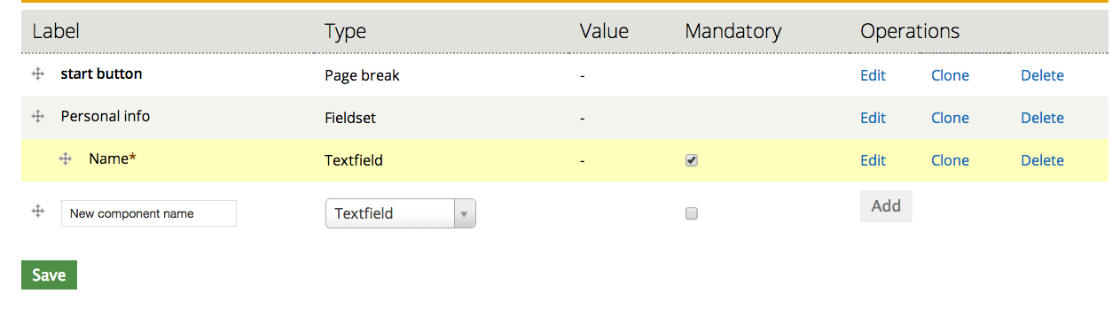
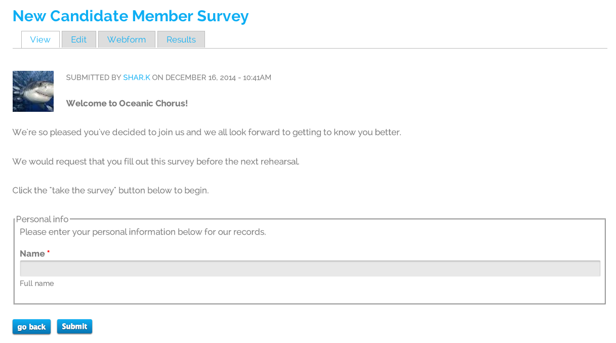
It will then look like this on the webform:
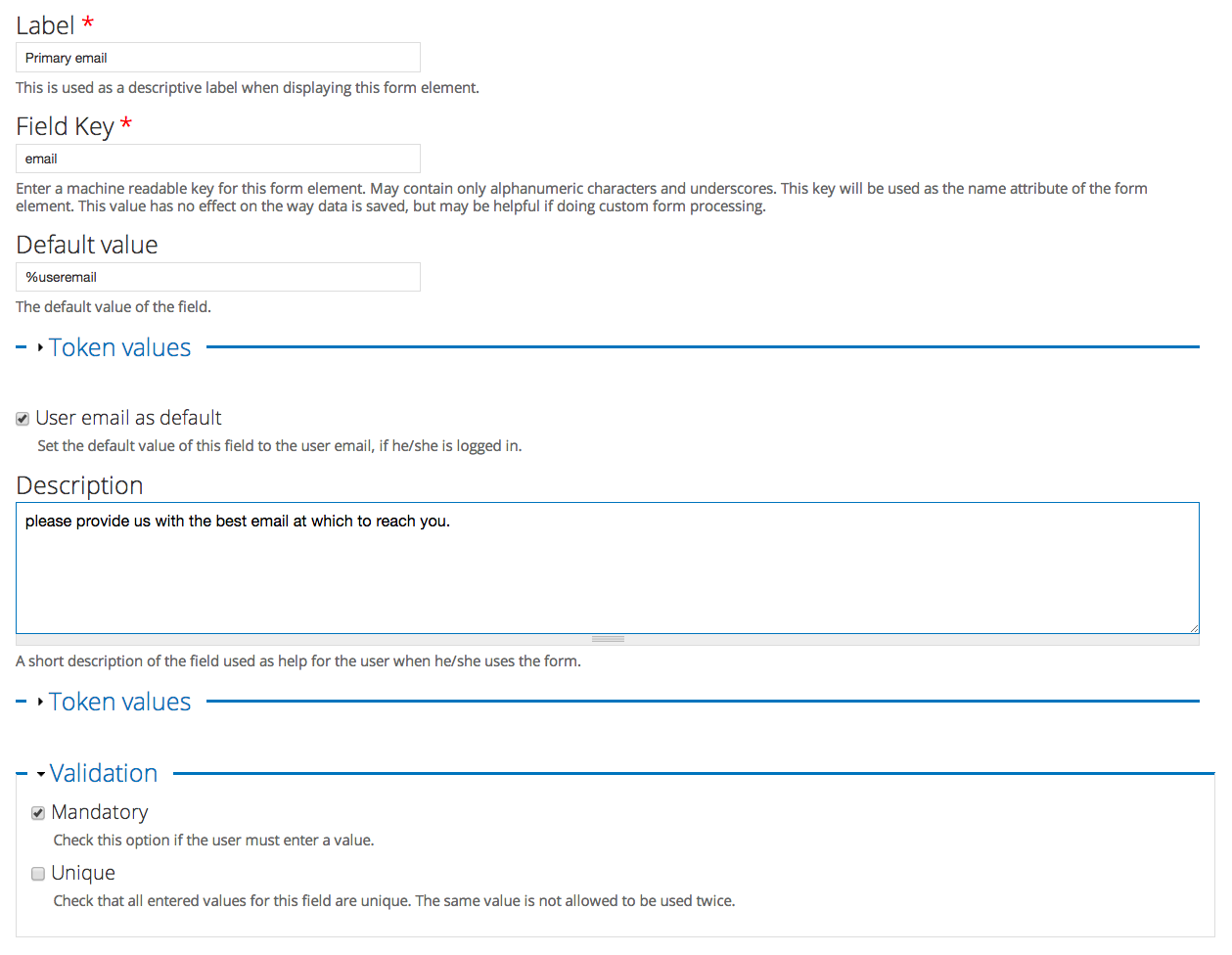
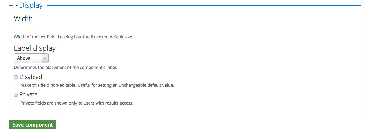
Format-specific fields: Email
The email field is useful when you want to make sure that people enter their email in the correct format. It is also useful because it can be auto-filled based on user data if they are logged in.
Select and add the component type "Email".
The settings page looks like this:
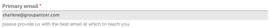
The saved component looks like this:
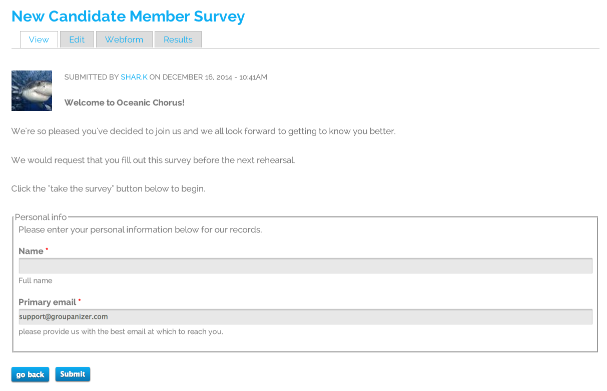
After the component has been saved and placed under personal info, the webform looks like this:
Format-specific fields: Date
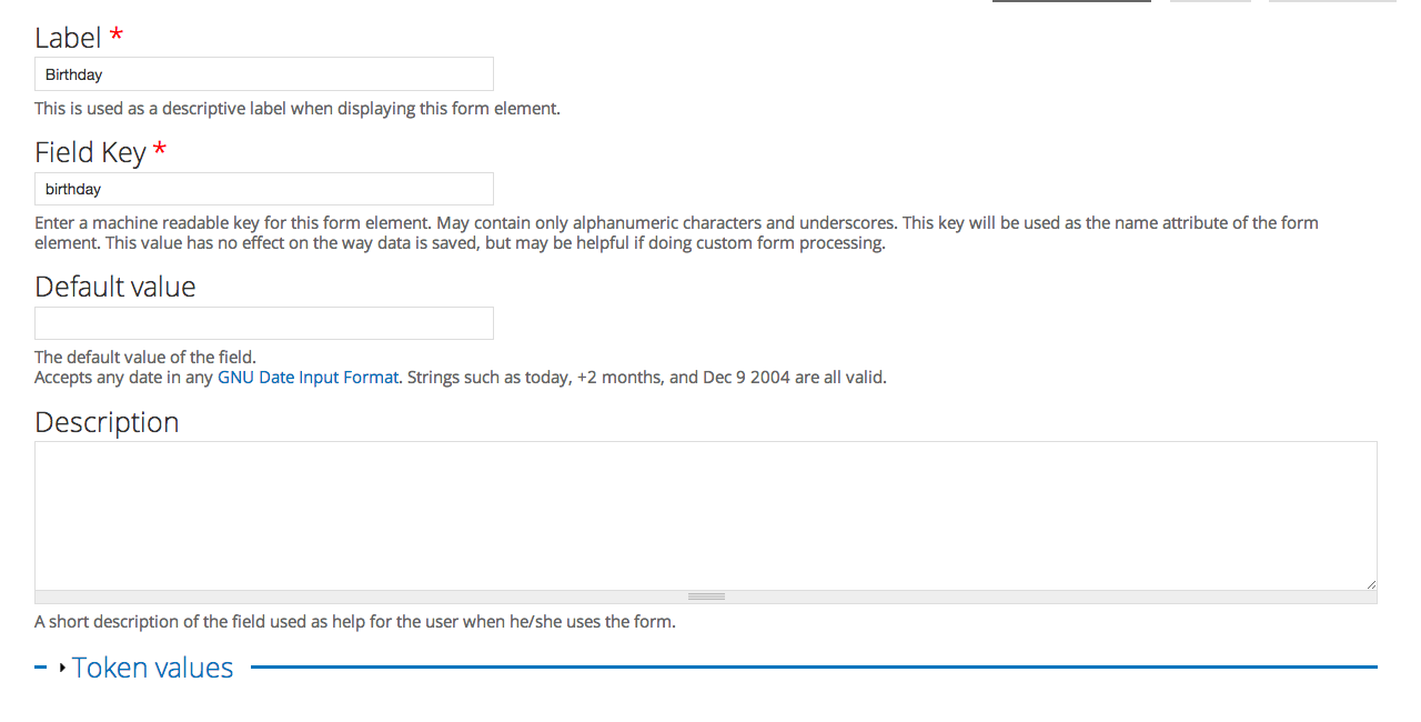
In this example, we're be creating a birthday date field. Add the component type "Date".
Here is the settings form:
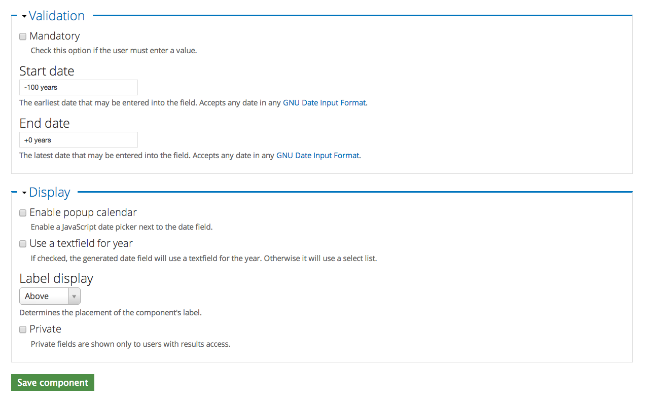
Note that The start and end date make sense for birthdays. if you have an age restriction on your chorus (members must be ___ years old to join), then you may want to build that into this form. Otherwise the end date should be +0 years in order to make the last available year the current one.
I also removed the "enable popup calendar" option under the display options, as it's often confusing when entering birthdays.
Here is the saved component:

This is what it looks like once added to the webform under the personal info field set:
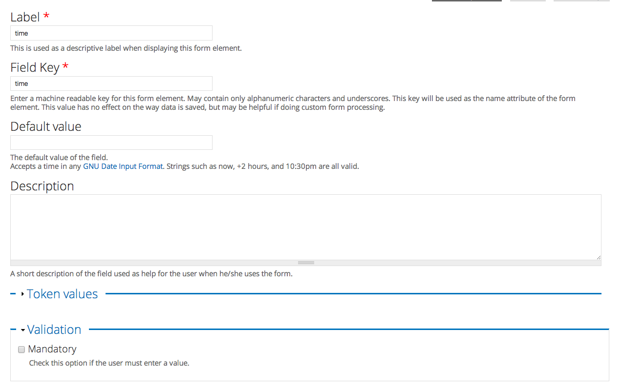
Format-specific fields: Time
Time is a field that doesn't always make sense to use - especially on a webform such as this. But it is useful, once again, for forcing a formatting style.
If you're going to use the time field, add the component type "Time".
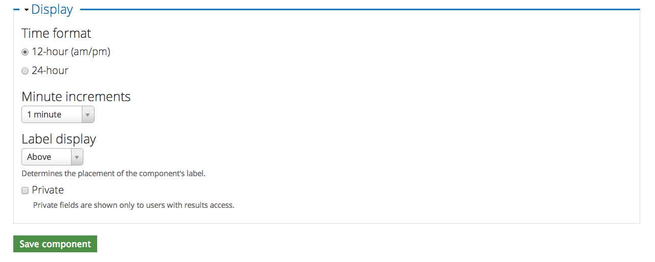
Here's what the configuration page looks like:
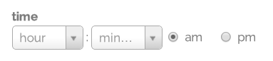
And here's what the component looks like when it's been added:
Markup
Markup is used to add text into your webform. This is good for adding extra instructions or information that may be needed before the next set of questions.
Choose and add the component type "Markup".
Here's what the configuration page looks like:
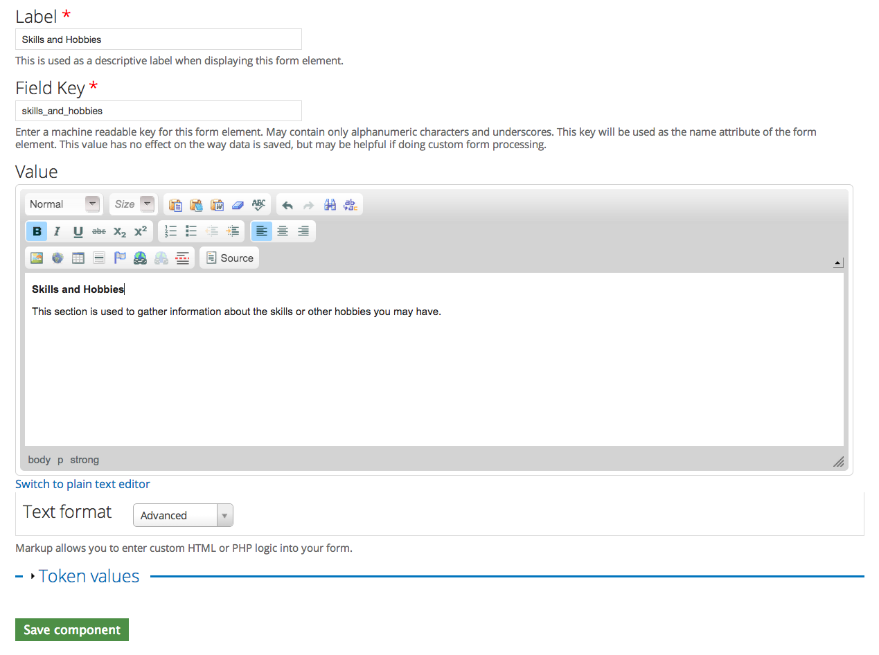
Note: A markup component does not have a visible title. If you want to give the markup text a visible title, you'll need to place it in the value field.
After saving, the component looks like this:

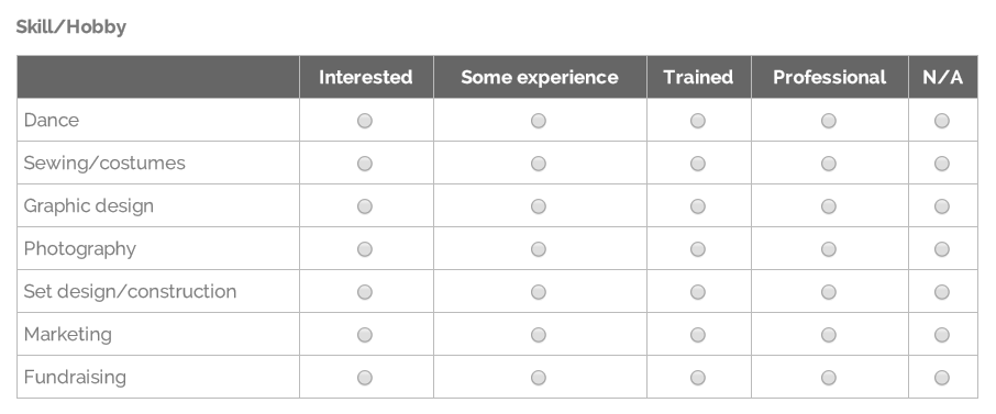
Multi-question grids
Multi-questions grid formats are useful for Likert scale questions where answers for various questions include a list of identical answer choices.
Choose and add the component type "Grid".
The configuration page will look like this:
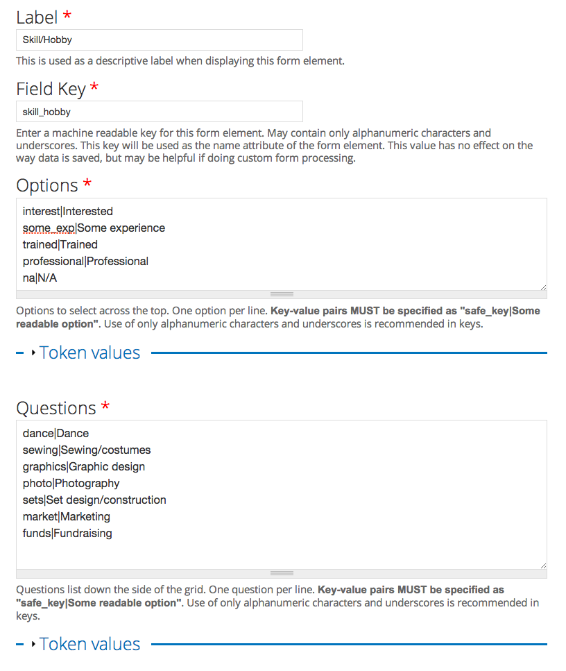
For detailed instructions on how to format the options in the Options and Questions areas, please refer to the section in How to: Create a webform that deals with multiple choice questions.
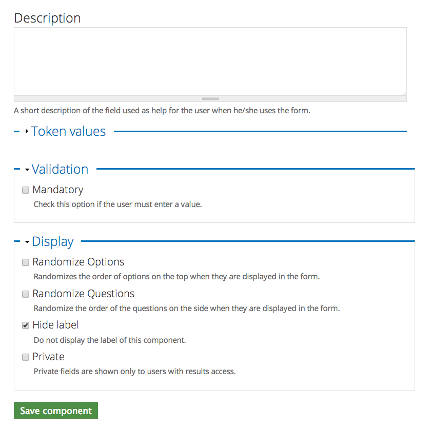
In this example, you'll notice I've decided to hide the label - this is because of the title I put in in the previous component. Once saved, the component looks like this:
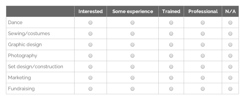
With the label, the component would look like this:
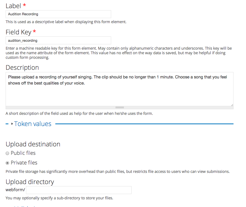
File Upload field
File upload fields work well if the person filling out the survey is expected to send along a file as well. Sometimes this is used for a PDF form that needs to be sent with it, or some choruses have used it for a logo contest.
Choose and add the component "File".
In this example, we'll be creating a place for a possible new member to upload a recording. Here's the set up page:
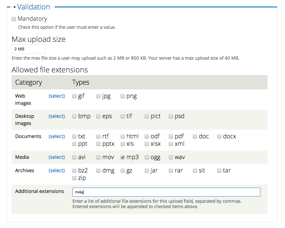
Be sure to note where these files are being saved. Also, be mindful of what you're letting people upload to your site and the file sizes you're allowing.
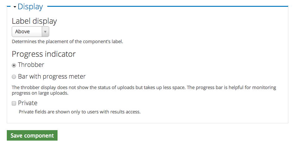
This is what the saved component looks like:

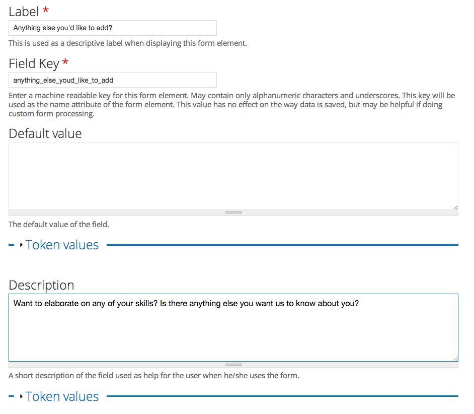
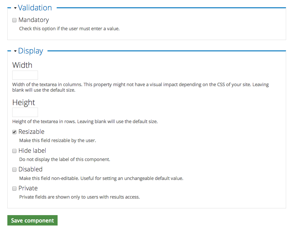
Text Area
Text areas are a simple way to allow for long-answer responses. In this example, we'll be adding a place for the survey-taker to add any last comments.
Choose and add the component type "Text area".
Here's the configuration page:
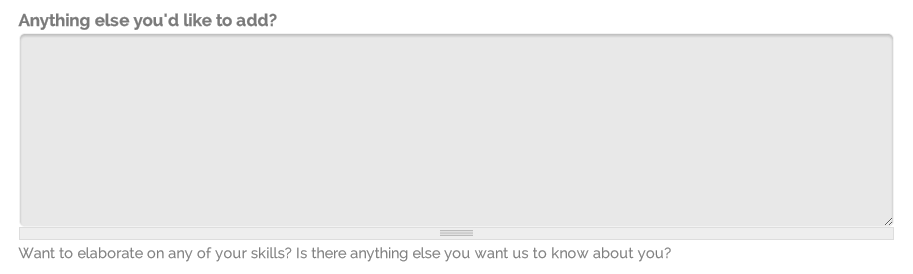
And here's what the component looks like after it's been saved:
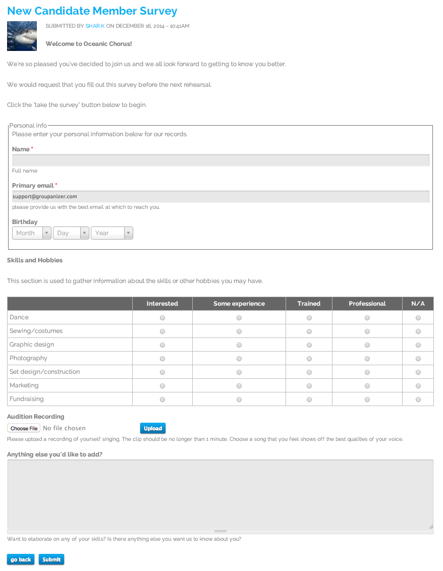
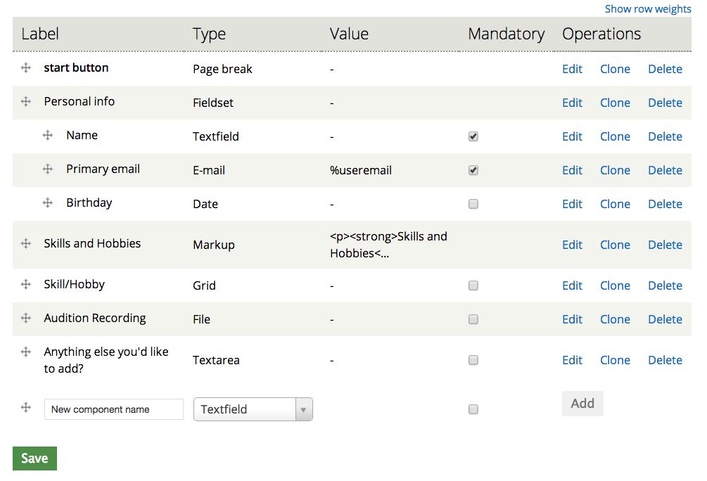
The completed webform
The component list
Page one
Page two