Create a webform: Basic question styles
This article will guide you through how to create a webform.
It includes:
- Creating a new webform
- The common question types (text field, multiple choice, multi-select, and number)
- how to re-order questions
Creating a new webform
Navigate to: Settings & admin > Add content > Webform
or: Communication area > Webforms / Surveys, and click the "add webform" link in the top right corner
Users will only see this option if they have permission to create webforms (which is limited to site admins, and webform admins).
This will open a page that allows you to create a new webform. The first page is essentially the "intro" to the survey. You will add your fields and questions after saving this page.
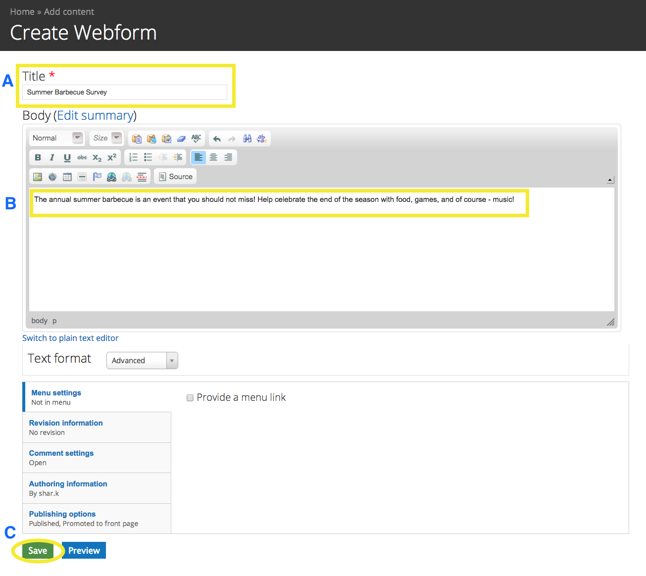
A - Fill out the title of the webform. It can be something simple, or more detailed - but try to keep it to the point.
B - this is where you can communicate with the people who will be filling out the webform. This should not include questions. It should only act as a preface to your questionnaire.
C - When you're finished, click save. Don't worry, you can come back and edit this later if you have the need.
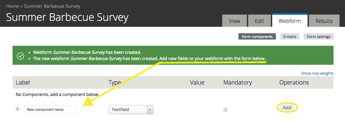
Adding Questions
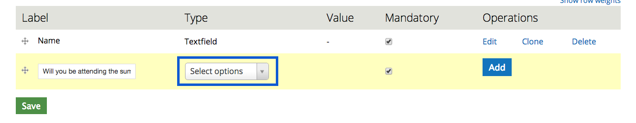
After saving, you will be brought to a page that will let you add the "components" to your webform. These components are the questions you wish to ask, or the fields you wish to collect data from.
Common question formats
Short Answer
Short answers questions, or "textfields" are great for collecting unique data, such as a name.
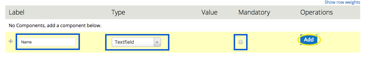
In the picture below, you can see that the label has been filled out with the "question", or in this case, the label of what the person answering the survey should be entering into the text field. In this example the label is "Name". The type has been set as "textfield", and the mandatory checkbox has been left blank.
NOTE: The mandatory checkbox can be checked at any time - all it does is make that field mandatory to fill out. You can check it now, if you're sure this filed should be mandatory, you can check it later, or you can also mark it as mandatory on the next screen after the component has been added and we're asked to provide some more details.
This is the screen that will appear after you have clicked "Add".
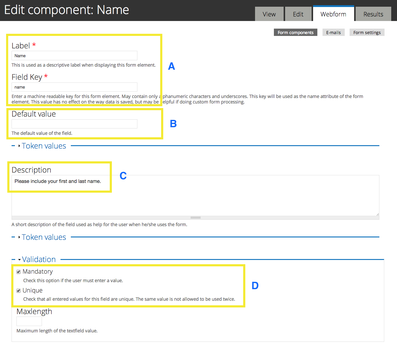
A - These fields are auto-filled from the label entered on the previous page. You should not have to add anything to them, but you can edit them if you need to.
B - You can include a default value for almost all questions - sometimes it makes sense to do this, and sometimes it's better to leave it blank. For a name field, it's better to leave it blank so it's not accidentally missed.
C - The description can be used to provide further explanation of your question, or the kind of answer you are looking for.
D - Here is where you can also choose to make this component mandatory. You also have the option to make sure all answers are unique in this field. Be careful with this - make sure that it makes sense for the type of data you are gathering.
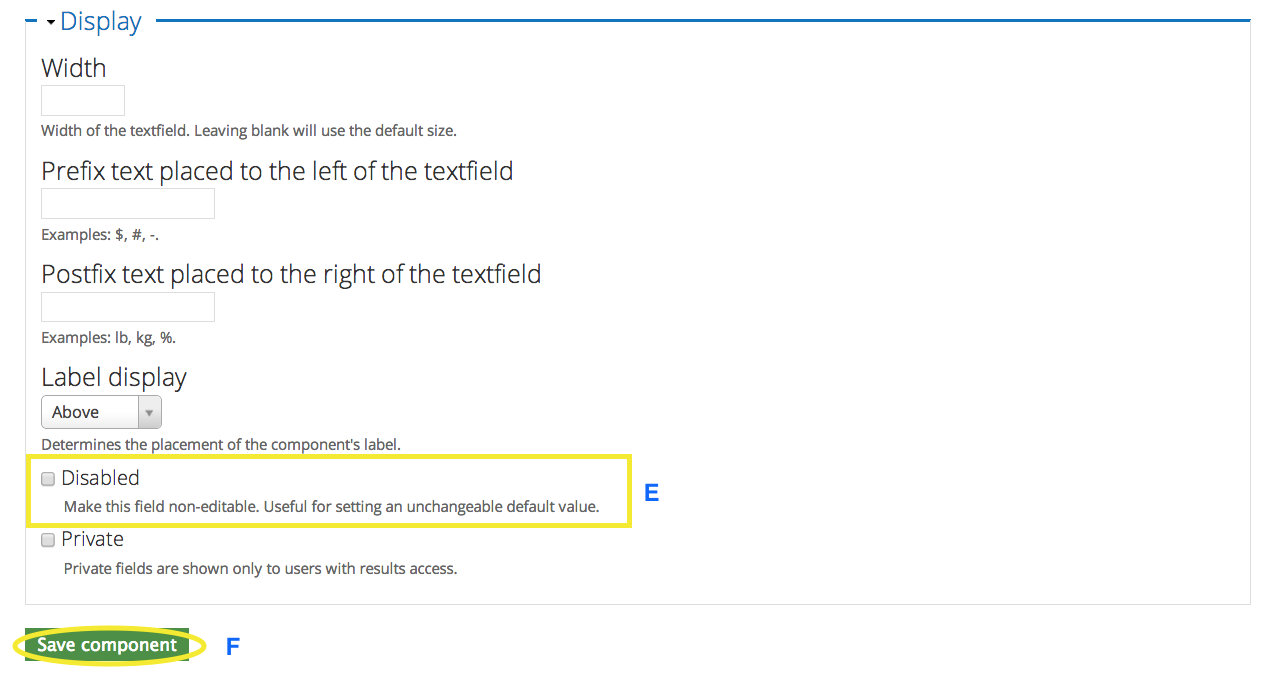
E - It is rare to disable a field on a webform, but it can be useful for collecting data from a certain subset of members of your group, and still record that data in the results. Chances are you wouldn't use it for a textfield, but you may use it for a selection list that notes a smaller ensemble within your group. If you do decide to disable a field, make sure you fill in the default value (B).
F - When you're done, remember to click save. Don't worry if you're not sure if you've set it correctly just yet. You can always edit this component again later.
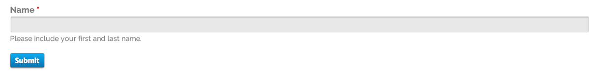
Here is an example of a completed text field using the settings shown above.
NOTE: Not all available settings were described here. You can set extra restrictions for text fields, such as max character length, etc. But for basic webforms you're sharing with members, you wouldn't have to worry about that too much.
Multiple choice
Multiple choice questions are your typical A, B, or C questions. They are probably one of the most common basic question formats. Only one answer can be selected.
When adding this component to your webform, you'll want to choose "Select options" as the type.
Here is the configuration page that will appear after you click "Add". You'll notice that parts of it are very similar, if not identical to the form that was used for a textfield component. The biggest difference is highlighted in yellow.
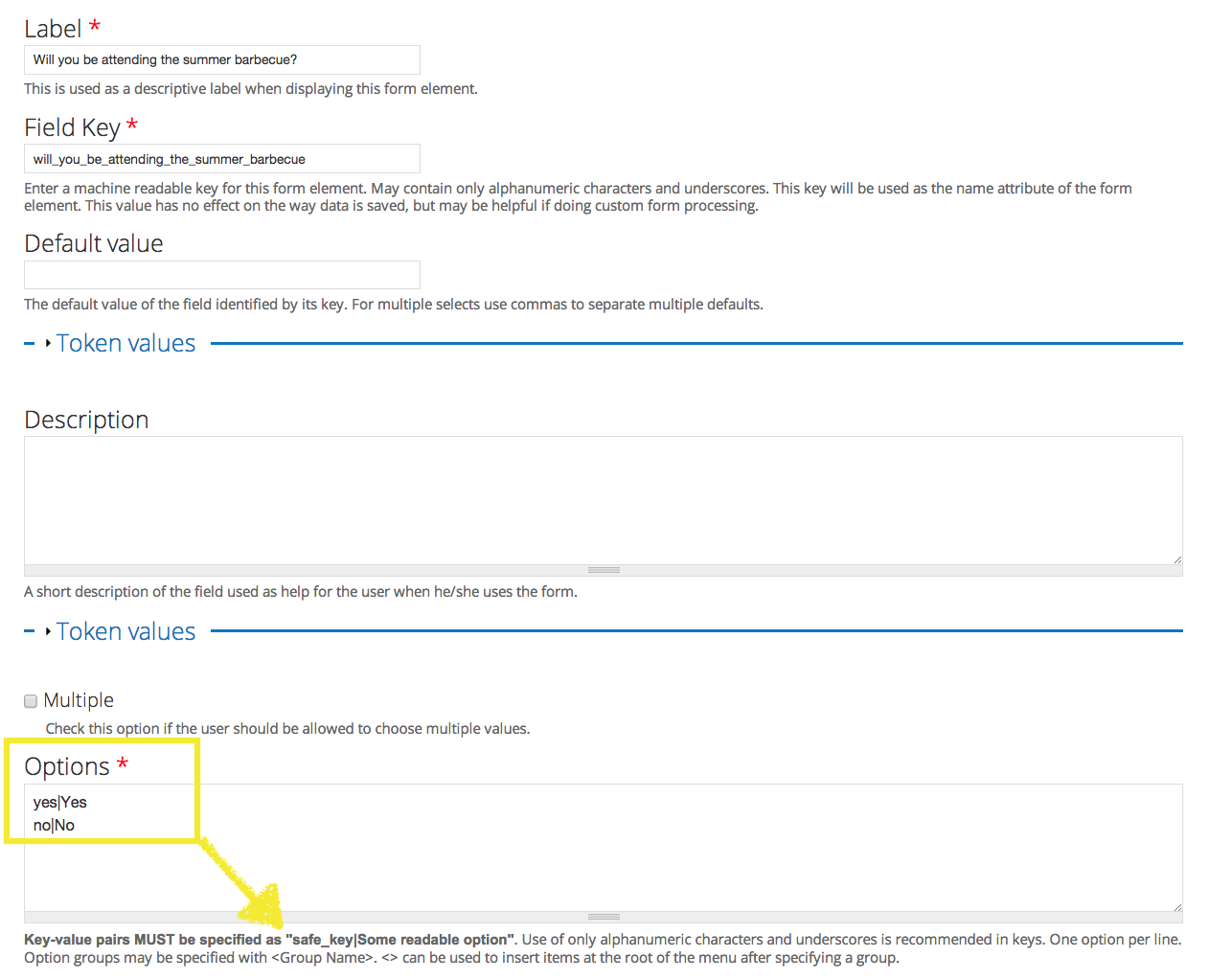
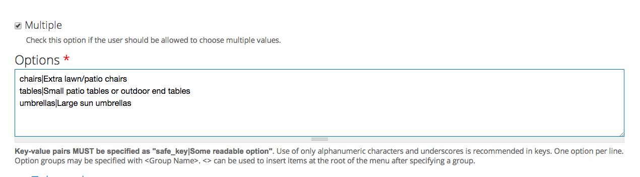
This yellow box is showing the space where you can set the options your survey takers will have to choose from. the arrow is pointing to a reminder on the form about the format that needs to be used in order for the system to read the answers properly.
You'll notice that each option is on a separate line. Then there are two main parts to each possible answer. The first part is the "machine readable" name - this mean a "computer friendly" name, so it shouldn't have any capitals or spaces. if you need to use multiple words, either squish it together, or use underscores. The second component is the human-friendly option. You can use capitals, spaces and punctuation in this part. The two parts are separated only by the flat bar | (it should appear on the same key as \ )
So, another way to write these options would be:
willattend|Yes, I will attend
wontattend|No, I won't attend
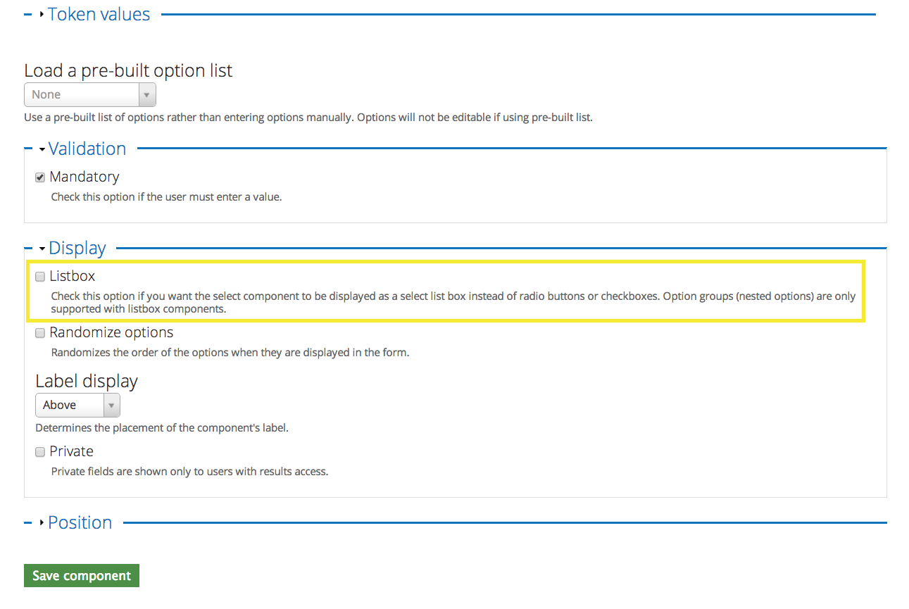
The other common option on the configuration page for multiple choice questions is to choose whether it appears as radio button selecitons, or in a list box.
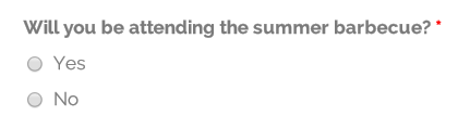
Here it is with radio buttons
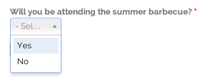
And here it is in the list box style
Remember to save your changes!
Multi-Select
Multi-select is the option for you if you want your survey-takers to be able to select more than one answer to a question.
It starts off the same way as multiple choice - it uses "Select options" as the type.

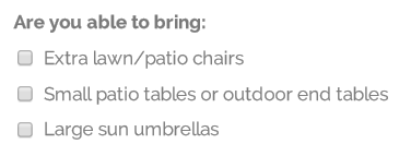
The rest of the form is also handled the same way as multiple choice questions (see above for details about how to fill out the configuration), except you'll place a checkmark in the box above the Options area that says "Multiple" so that they can select multiple values. In the example below, you can see that the Options area is filled out in the same format as a multiple-choice question.
Again, you can choose to have it appear with checkboxes by default
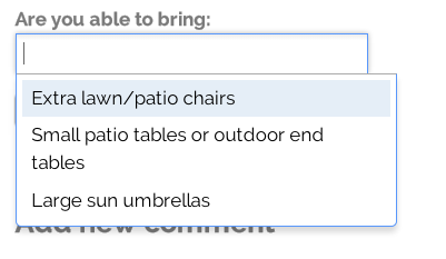
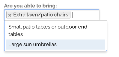
Or you can checkmark the "Listbox" option
Numbers
Number fields are excellent for collecting numerical data without too much work on your part. You'll want to select the component type of "Number".

Here are the most important settings on the component configuration page for this type of component.
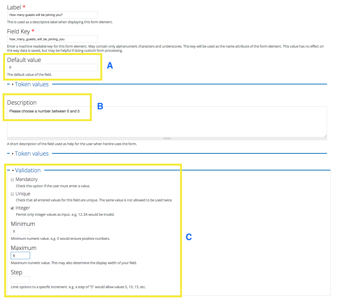
A - You can set a default value. It's usually a good idea to do this for numerical data as it helps make results gathering much easier once you start collecting answers. It also helps to make the right format of answer much clearer to the person filling out the survey.
B - Providing details about the answer also helps your survey-taker to provide the best answer possible.
C
- You have the option to make this field mandatory, but make sure that it makes sense for the type of data you're gathering.
- You also have the option to make answers unique - and again, make sure that this option makes sense for the types of answers you expect.
- You can also select "Integer" to make sure people use whole numbers. For this example, check-marking integer is the only selection we'll make from these options.
- Setting the minimum and maximum values also helps to limit answers to ones that make sense, or to impose certain restrictions
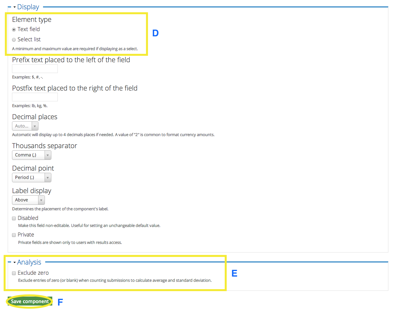
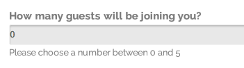
D - For this display option, you can choose between a "text field" style
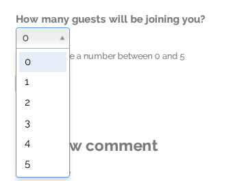
or a "select list" style
E - You can also choose to exclude zero. This would depend on the type of data you're gathering. In some cases (such as ticket purchase) including zero would not make sense, unless there's multiple choices for types of tickets.
F - Remember to save your changes! If you need to make changes you can always click on the component's edit link and fix it later.
Organizing your webform
Moving Components
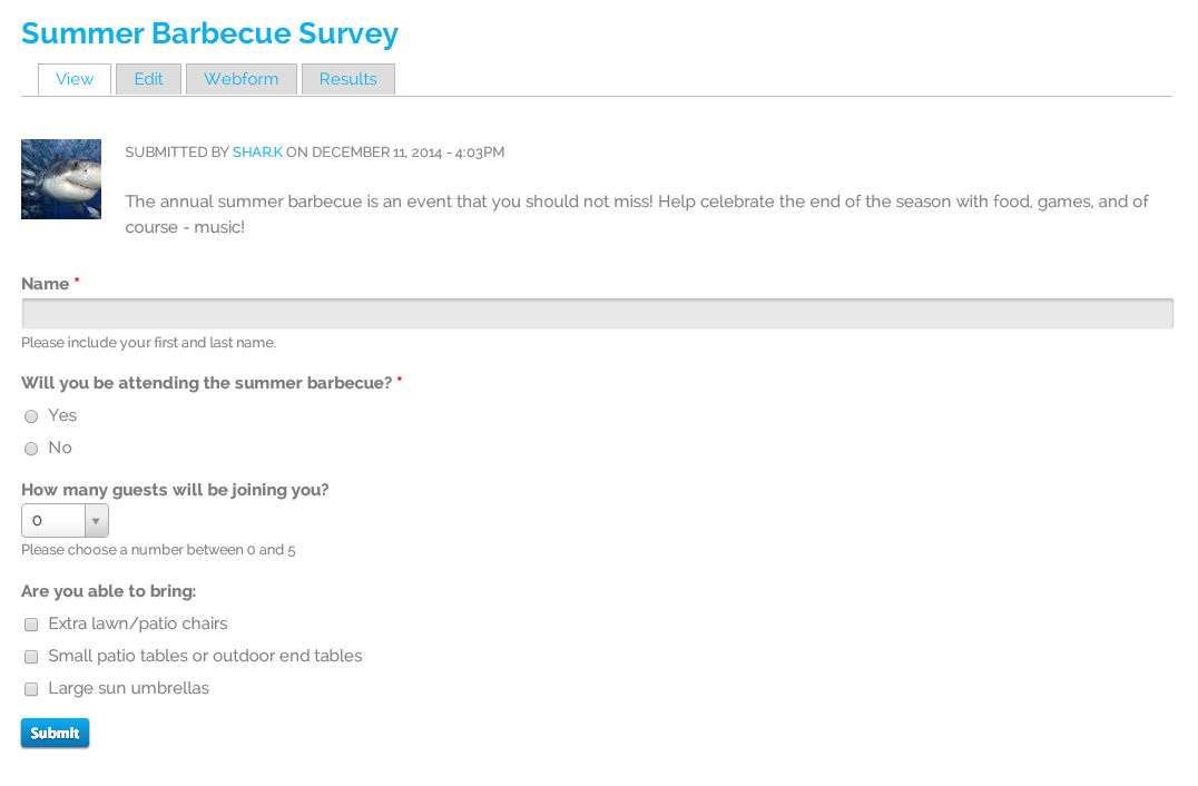
The webform we just created currently looks like this:
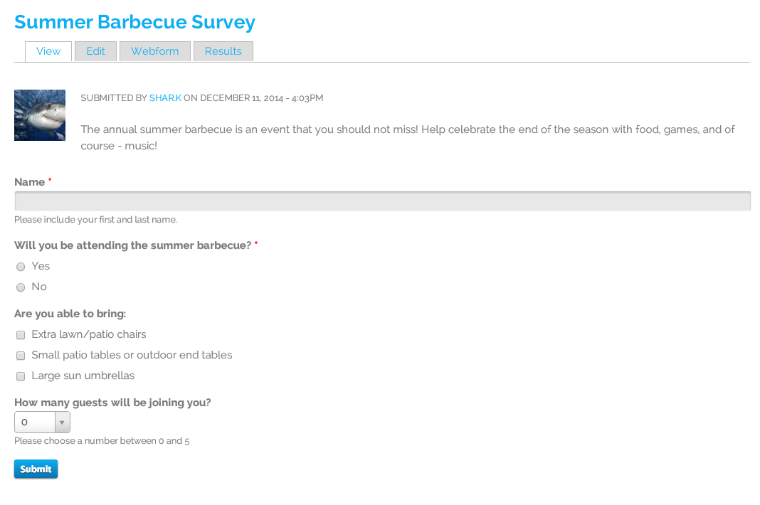
But this may not be the most logical order in which to answer these questions - so what can we do?
Thankfully we don't have to undo anything, we need only to move the components into the order we want.
First, click on the "Webform" tab to view the components. it will bring you to a page that looks like the image below. Note the cross-hair arrows on the left edge. These errors can be used to drag and drop components into your preferred order.
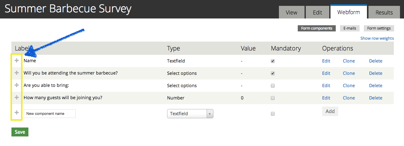
Just remember to save the page before you navigate away after making changes.
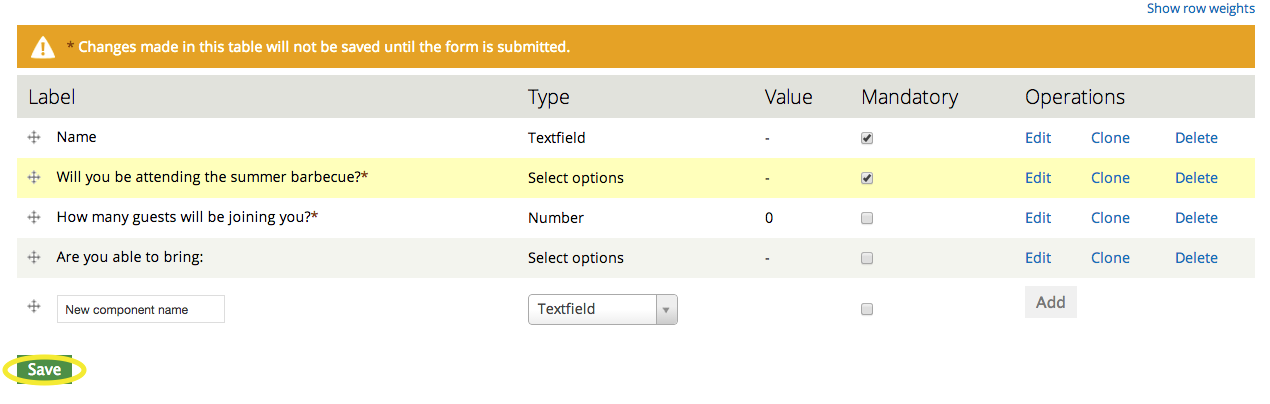
Then, you can click on the view tab to see your newly organized webform.